


Hey there! As a supplier of Color Newspaper Printing, I've seen firsthand how a well - chosen color scheme can make or break a newspaper. In this blog, I'm gonna share some tips on how to select the right color scheme for a color - printed newspaper.
Understanding the Basics of Color Psychology
First off, it's important to understand a bit about color psychology. Different colors evoke different emotions and reactions. For example, red is often associated with passion, energy, and urgency. It can grab readers' attention quickly, which is great for headlines or important announcements. Blue, on the other hand, is linked to trust, calmness, and reliability. It's a popular choice for more serious and trustworthy newspapers.
Yellow is bright and cheerful, and it can add a sense of optimism. Green is associated with nature, growth, and health. Purple is often seen as luxurious and sophisticated. When you're choosing a color scheme for your newspaper, think about the message you want to convey and the emotions you want to evoke in your readers.
Considering Your Audience
Your audience plays a huge role in color scheme selection. If your newspaper is aimed at a younger demographic, you might want to go for more vibrant and trendy colors. Younger readers are often more open to bold and bright color combinations. For example, a newspaper targeting teenagers might use a lot of neon colors to stand out.
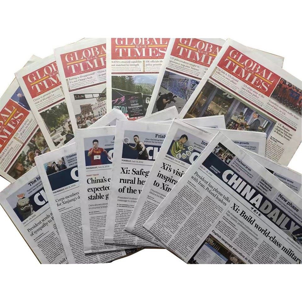

On the other hand, if your audience is more elderly or conservative, you might want to stick to more traditional and muted colors. A business - oriented newspaper might choose a color scheme that exudes professionalism, like a combination of gray, black, and blue.
Branding and Consistency
If your newspaper is part of a larger brand, it's crucial to maintain consistency with your brand's color scheme. Your brand colors are like a signature, and they help readers recognize your newspaper at a glance. For example, if your brand's main color is orange, you should incorporate orange into your newspaper's color scheme in some way.
Consistency also applies to the different sections of your newspaper. If you have a sports section, a business section, and a lifestyle section, each section should have a consistent color theme. This makes it easier for readers to navigate and find the content they're interested in.
Contrast and Readability
One of the most important factors in color scheme selection is contrast. You want to make sure that the text on your newspaper is easy to read. This means choosing a color for the text that contrasts well with the background color. For example, black text on a white background is a classic and highly readable combination.
However, you don't have to stick to black and white. You can use other high - contrast color combinations, like white text on a dark blue background or yellow text on a purple background. Just make sure that the contrast is high enough so that the text is legible, even from a distance.
The Printing Process
As a Color Newspaper Printing supplier, I know that the printing process can affect how your colors look. Different printing methods and paper types can change the appearance of colors. For example, newsprint paper has a slightly rough texture, which can make colors look a bit different compared to a smooth, glossy paper.
Before finalizing your color scheme, it's a good idea to do some test prints. This will allow you to see how the colors look in the actual printing process and make any necessary adjustments.
Trends in Newspaper Color Schemes
It's also a good idea to keep an eye on current trends in newspaper color schemes. In recent years, there has been a trend towards more minimalistic and modern color palettes. Many newspapers are using fewer colors and focusing on high - contrast combinations to create a clean and sophisticated look.
However, trends come and go, and it's important to balance following trends with maintaining your newspaper's unique identity. You don't want to change your color scheme too often, as this can confuse your readers.
Case Studies
Let's take a look at some real - world examples. The New York Times has a very traditional color scheme, with a lot of black, white, and gray. This gives it a serious and trustworthy look, which is appropriate for a major news publication.
On the other hand, some alternative newspapers use very bold and colorful schemes to attract a younger and more alternative audience. For example, a local arts and culture newspaper might use a lot of bright pinks, greens, and yellows to stand out.
Combining Colors
When combining colors, it's important to use a color wheel as a guide. Complementary colors, which are opposite each other on the color wheel, create a high - contrast and visually appealing combination. For example, red and green, or blue and orange.
Analogous colors, which are next to each other on the color wheel, create a more harmonious and soothing look. For example, a combination of blue, blue - green, and green.
You can also use a triadic color scheme, which involves using three colors that are evenly spaced on the color wheel. This creates a balanced and vibrant look.
Other Printing Services
In addition to Color Newspaper Printing, we also offer Fine Art Book Printing and Periodical Printing. These services also require careful color scheme selection, and the principles we've discussed here can be applied to them as well.
Conclusion
Selecting the right color scheme for a color - printed newspaper is a complex process that involves understanding color psychology, considering your audience, maintaining branding consistency, ensuring readability, and taking into account the printing process. By following these tips and keeping an eye on trends, you can create a newspaper that looks great and effectively communicates your message.
If you're interested in our Color Newspaper Printing services or any of our other printing services, we'd love to have a chat with you. Whether you're a small local newspaper or a large national publication, we have the expertise and resources to help you achieve the perfect color scheme for your printed materials.
References
- "Color Psychology: The Meaning Behind Colors" by Verywell Mind
- "The Impact of Color on Marketing and Branding" by HubSpot
- "Printing Techniques and Color Reproduction" by Printing Industries of America